Serenity and minimalism.
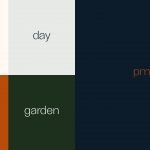
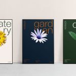
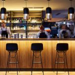
The whole identity exudes serenity and minimalism in a naturally beautiful way, leaving room for the individual experience itself. Your version of the restaurant. The logotype is minimalistic yet fresh and modern, with an international look and feel to attract both international hotel visitors as well as local people. Using a single beautiful and minimalist sans serif typeface with interesting details gives the identity a holistic overall look and feel. The photography style uses mirrors to find new perspectives, scenes and versions with reflections. By giving different and surprising versions of the food, drink and atmosphere, the identity has a fun and joyful twist. In addition to the Edenlike backyard, flowers used throughout the identity, bring out the garden feel in the restaurant, creating a feminine, delicious and joyful look. A hint of California. The colours of California create a fresh and comfortable look for the visual identity. The colour palette also follows different times of the day, as the restaurant connected to the hotel is open around the clock.