Kalevala Jewelry hired BOND to reimagine their brand as part of a major strategy seeking strong growth and increasing desirability among new consumers.

Kalevala Hero image by BOND

Kalevala Jewelry

A new era for a legacy brand

Kalevala Jewelry, an iconic Finnish jewelry brand taking its name from Finland’s national epic, hired BOND to reimagine their brand as part of a major strategy seeking strong growth and increasing desirability among new consumers. BOND and Kalevala Jewelry worked in close collaboration with the delicate task of reviving and modernising their brand, while at the same time strengthening the bond to their past and backstory. In this process was also the merger of Lapponia, another legacy brand owned by Kalevala Jewelry, into the main brand and a name change to simply Kalevala.


BOND was tasked to work on all aspects of this new brand from new logo and identity, store interiors, packaging and design of all touchpoints to verbal narrative, launch marketing and film.

More Info

client:

Kalevala Koru

website:

kalevala.fi

contributions:

Brand strategy

Brand identity

Web visual design

Tone of voice

Motion graphics

Logo design

Packaging design

Graphic design

Store design

Spatial design

Interior design

Product display

Furniture design

Copywriting

Art direction

Film

Marketing design

awards:

ADCE Awards, 2x Silver, 2021

Dieline Awards Silver, 2021

Best of Finnish Advertising and Design, 2x Silver, 2020

The Type Directors Club Certificate of Typographic Excellence, 2020

industry:

Jewellery

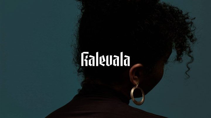
An Oath to the Future

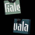
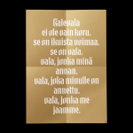
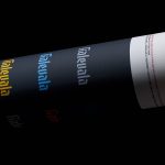
As a centrepiece of the project BOND created the platform VALA that means OATH in Finnish. By simply removing the first four letters in the brand name BOND gave Kalevala a way to clearly express their values in a way that ties directly to their name. This platform was inspired by the simple idea that not only jewelries are eternal pieces, but so are the bonds they create between people. So are the promises that come with them. This platform now forms the basis for marketing messages and Kalevala’s more value driven projects. A simple and flexible messaging system that will only grow stronger over time.

Mythical and modern

From packaging and in-store look and feel, to jewelry packshots and jewelry on models, to brand and marketing images, multiple levels of photography were defined to address the need of very different types of imagery. The images for packaging and in-store were inspired by Northern nature, but not in the classical sense. We wanted the mythical, mystical and dramatic national epic to shine through. Something ethereal hiding just under the surface of still lake water in a deep forest. These images were subtly animated to give them life on digital screens in the retail spaces.

Up close and personal

New brand images were created to support the platform VALA (Oath) in which the relationship between people and the promises we give each other and ourselves play a big role. Mothers and daughters, siblings, couples and generations. VALA also means celebrating the freedom to choose who to be and how to be. A promise, or oath, to oneself.

A well framed identity

Inspired by old framed photos of past generations, BOND translated shapes of classic frames into their simplest possible forms. This series of different frames are used throughout the identity as a strong brand element. Clear and recognizable at distance they are the backbone of the identity’s form language.

Kalevala Store by BOND 04

A forest meadow in the middle of the city

The new Kalevala brand plays with the contrast between a modern, simple look and the rich, mystical world of the national epic. The store spaces are heavily inspired by Finnish nature with its deep pine forests, lichen and lakes. Real wooden logs carry minimalistic product displays. Cabinet fronts are adorned with a metallic ripple effect to simulate lake water and floors are moss textured and soft. This, combined with indirect lights and soft curtains along the back wall that dampens sound, creates a calming and pleasant space to be in.

Kalevala Store by BOND 02

Practical and digitally connected

The store is a living space. Digital displays in frames bring in life in the form of subtle moving images and can be updated on a whim to reflect new seasons and campaigns. In-store tablets offer a deeper look into the Kalevala catalog and the jewelry fitting area serves as the goldsmith's workstation, when not used by guests to try out the exclusive products.

Kalevala Store by BOND
Kalevala Store by BOND 03

An ode to the original

While the brand overall needed to feel modern and contemporary, it was equally important for Kalevala to strengthen the bond to their past and legacy. The new logotype honours the very original logo of Kalevala Koru from the 1930s. A tribute to its timelessness and confident, iconic forms. BOND also included subtle elements from the logo used during the last few decades, to keep it familiar for audiences unfamiliar with the company’s long past. The visual identity of the new Kalevala is built around this recognisable and confident logo. Respecting the past, ready for the future.

Kalevala Bags by BOND

Ownable words

A complete typography was created based on the new logotype for the brand. Strong calligraphic and characteristic letters leave no question of the brand behind the messages. BOND wanted the typography itself to be so recognizable that the logo could be left out of execution and still be unmistakingly Kalevala. The typography is one of the new brand’s strongest links to tradition. It brings confidence to messages and to the people depicted in the brand’s more edgy and playful photographs. The original editions of the Kalevala epic, by Elias Lönnrot, used a similar strong and characteristic character set and have inspired inset emblems in old Kalevala Jewelries.

Kalevala Newspaper by BOND 2

Strengthening the emotional bond between a brand and its audience

BOND was also tasked to create a launch campaign that would not only generate awareness, but seed the renewed brand out in the world in a meaningful way. For this a simple idea was born. That a jewelry represents something much stronger than the precious metals it is made of. It’s an oath – a promise between people. In marriage or friendship. Between sisters and brothers. To yourself or to your ancestors. VALA is an open invitation for Kalevala fans and influencers to share their own personal stories about their most meaningful relationships with the hashtag #minunvala meaning “my oath” in Finnish.

Kalevala Brand Book by BOND

Designed to be tactical

One major aspect of the rebranding was to have a strong tactical angle to boost sales, not just to beautify the brand. Every execution is fundamentally tactical with two heroes, the wearer and the jewelry. High level brand images focusing on the story of the wearer and closer, more tactical images focusing on the story of the jewelry.

Kalevala Poster mockup by BON 02
Kalevala Poster mockup by BOND
Kalevala Art direction by BOND
We are very happy and proud of the outcome. Kalevala has now a worthy look. It is recognisable and ownable, and fits the era

Maria Uunila

Brand and Design Director

“Throughout the project and collaboration, we have been able to trust that the BOND team wants to make their best, and oversee the interests of the Kalevala brand. In the pitching phase, the team did more than we had asked for. Also, the ideas presented felt right for us and were built on our core values” rejoices Maria Uunila, Brand and Design Director of Kalevala.

Kalevala Pages by BOND
Kalevala Brand Book by BOND

Kalevala Koru