Joo. Carefree rental living.

Joo.

Space for living carefree

An entirely new brand for rental business of Asuntoyhtymä, a property developer and manager. Joo is founded on simplicity, clarity and positivity, all of which manifest in carefree rental living.

More Info

client:

Asuntoyhtymä Group

contributions:

Brand strategy

Naming

Visual identity

Motion graphics

Logo design

Verbal identity

Copywriting

Photography

Interior design

Sound design

industry:

Rental

Articulating carefree living

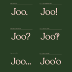
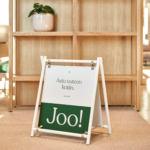
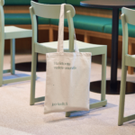
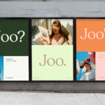
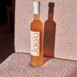
‘Joo’ is a colloquial expression for yeah or yes. It’s the most used word in the Finnish language and depending on intonation, also one of the most diverse in terms of meaning. In addition to being either a definite or doubtful response, ‘Joo’ can convey excitement or compliance, agitation or affirmation. As such it turned out to be the perfect name for a brand speaking to people at different stages of life, with disparate needs and dreams of what a home should be - which as the project progressed, transpired to be just one aspect of what Joo has to offer. Joo is about much more than apartments. It’s about offering a base for living the life you desire. It’s living as a service.

A verbally inspired identity

We knew that whatever we end up designing would need to help position Joo as warm and approachable. Figuratively and literally inviting people in. The shifting text-like logo incorporates necessary design cues without making it look too much like a conventional logo. Its default puncuation is a period, which acts as a conductor of the brands soft personality and playful motion language. As Joo continues to expand its offering, the logo’s flexibility combined with the warm colour palette provide a platform for taking the brand into multiple print and digital applications.

Less isn’t more, it’s just enough

The identity is all about keeping things simple, focusing on the essentials and therefore instilling a sense of carefreeness. By subtracting rather than adding elements, we managed to create space for endless combinations of colours, images, logo variations and conversational copy.

“We asked for a simple and beautiful brand. Not did we only get that, but a brand that defines our company culture. A brand that broadens our way of thinking and doing business. A brand that makes us believe even more in what we do. By saying Joo, we believe in new opportunities.”


Heta Kärki

Commercial Director,

Asuntoyhtymä Group

Asuntoyhtymä Group