Cloetta Allsorts - Less is more.

Cloetta Allsorts

Less is more

Confectionary maker Cloetta wanted to make their liquorice Allsorts stand out from the competition and highlight their new recipe. They were facing increasing competition from a growing number of mixed confectionary, in-store pick & mix, as well as from more and more aggressive private label brands. Cloetta was also looking to strengthen its position in travel retail. The challenge for Allsorts was to find its way out of the mainstream bulk position.

More Info

client:

Cloetta

website:

Cloetta

contributions:

Identity design

Graphic design

Packaging

awards:

The Dieline Award, 2014

industry:

Candy

WHAT YOU SEE IS WHAT YOU GET

Marko Salonen

Designer, Partner

BOND responded with packaging that brought the distinctive shapes and colours of the liquorice to the forefront. The Allsorts liquorice itself carries so much visual potential that we decided to take advantage of the geometrical playful shapes. The foundation for the concept was "what you see is what you get". By building on these existing strengths - the colour palette and name, but bringing the well-known shapes to a new level - rather than illustrating what's inside the pack, we let the shapes define the whole look & feel in a bold and playful way. The idea was to celebrate the iconic English liquorice in a contemporary way, turning Allsorts into a classic. The bold and playful packaging also helped consumers to easily identify the different varieties.

cloetta allsorts packaging design by BOND

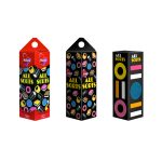
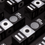
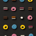
From ordinary to classic.

The client wanted to develop Allsorts to a more simple direction and to change the communication hierarchy. The creative path from ordinary to classic started from the facelift brief. The final design was created to communicate the renewed taste clearly, and to also position the product into Cloetta's classic product range.

Design inspires.

Inspired by the new design concept the client wanted to launch a new shape of the liquorice: an extruded format based on the same layered Allsorts tastes that were wrapped into flowpacks. The design follows the same principles as the original.

I'M NOT A BIG FAN OF THE PRODUCT BUT I HAD TO BUY THIS BECAUSE OF ITS NICE DESIGN

Consumer opinion

Design can drive product innovation.

The design can drive product innovation even more. This Allsorts product was developed hand in hand with the new design concept. Cloetta's Allsorts Black and White edition follows the similar bold design. This time we stripped away the colours reflecting the colourless sweet content while giving it a premium-feel. The silver print and matt finishing give a sense of quality to the functional cardboard box. The project included a flowpack and carton box, making the final concept simple yet effective and identifiable.

cloetta allsorts packaging design by BOND

Cloetta